auxIO
Description auxIO is an Augmented Audio app, being in that sense an Augmented Reality App. The idea for this app is based on the concepts behind apps like RjDJ and Situ.The name auxIO is made from aux, an abbreviation of the word “auxiliary" generally for audio, and IO, an abbreviation for input/output since this app’s core is the input from the user’s world and the result is the output in the form of audio.
Process
The concept for auxIO is a merge of features from a few different apps that were interesting but required a new interface. Initially, the idea was to only have the functionality of reactive audio on the app, where users would select a scene (downloaded from the marketplace) and could only control the microphone input volume. Later on, new features were added such as the functionality to create scenes in-app, and a new passive music mode where users would teach the app their music taste and then the app would create curated playlists according to the location, time of day, weather, and other factors.
User Profiles
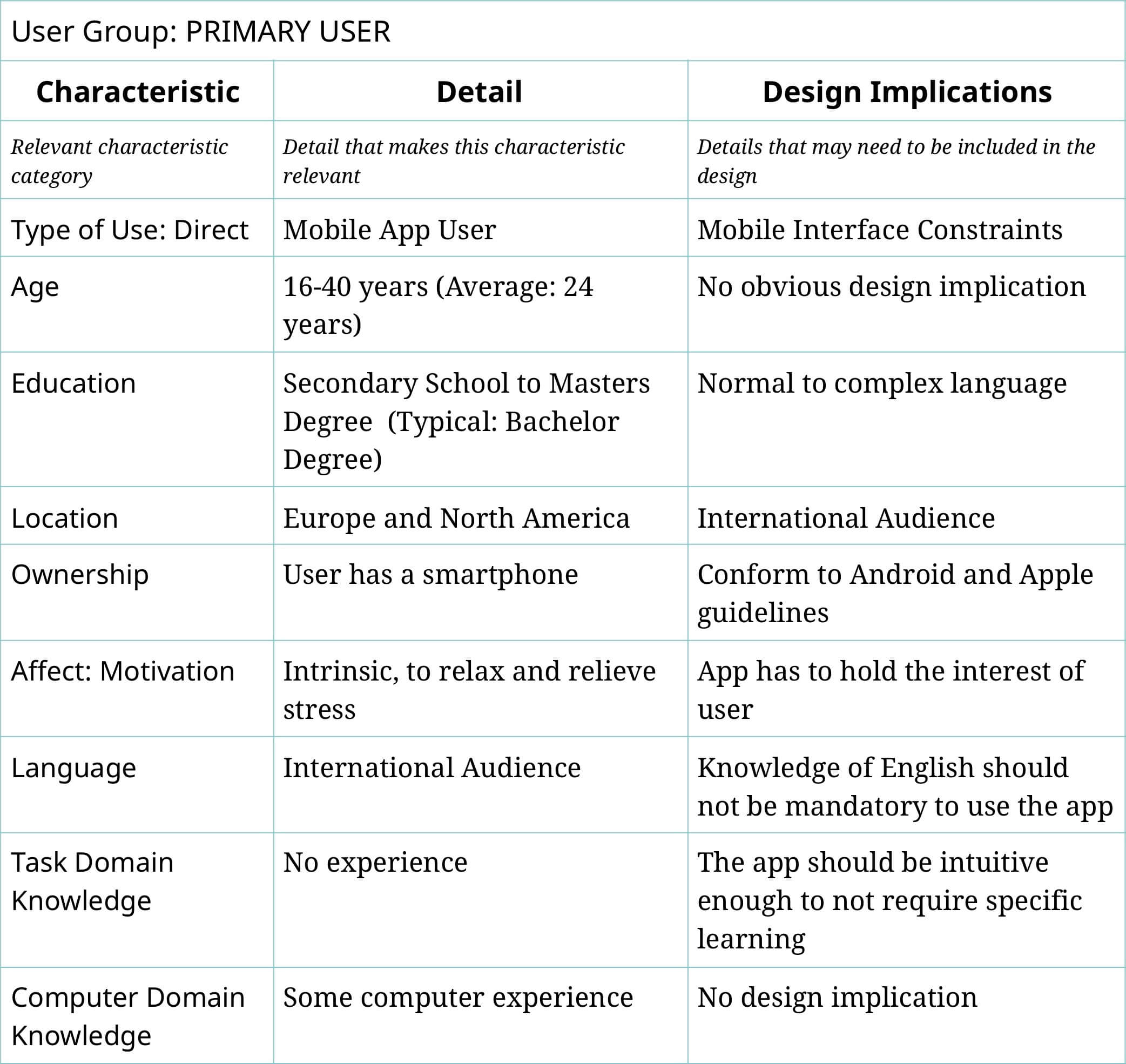
User Profiles help define the target group of a project based on research made with its users. User characteristics should be defined as a range that describes at least 80% of potential users.
Personae
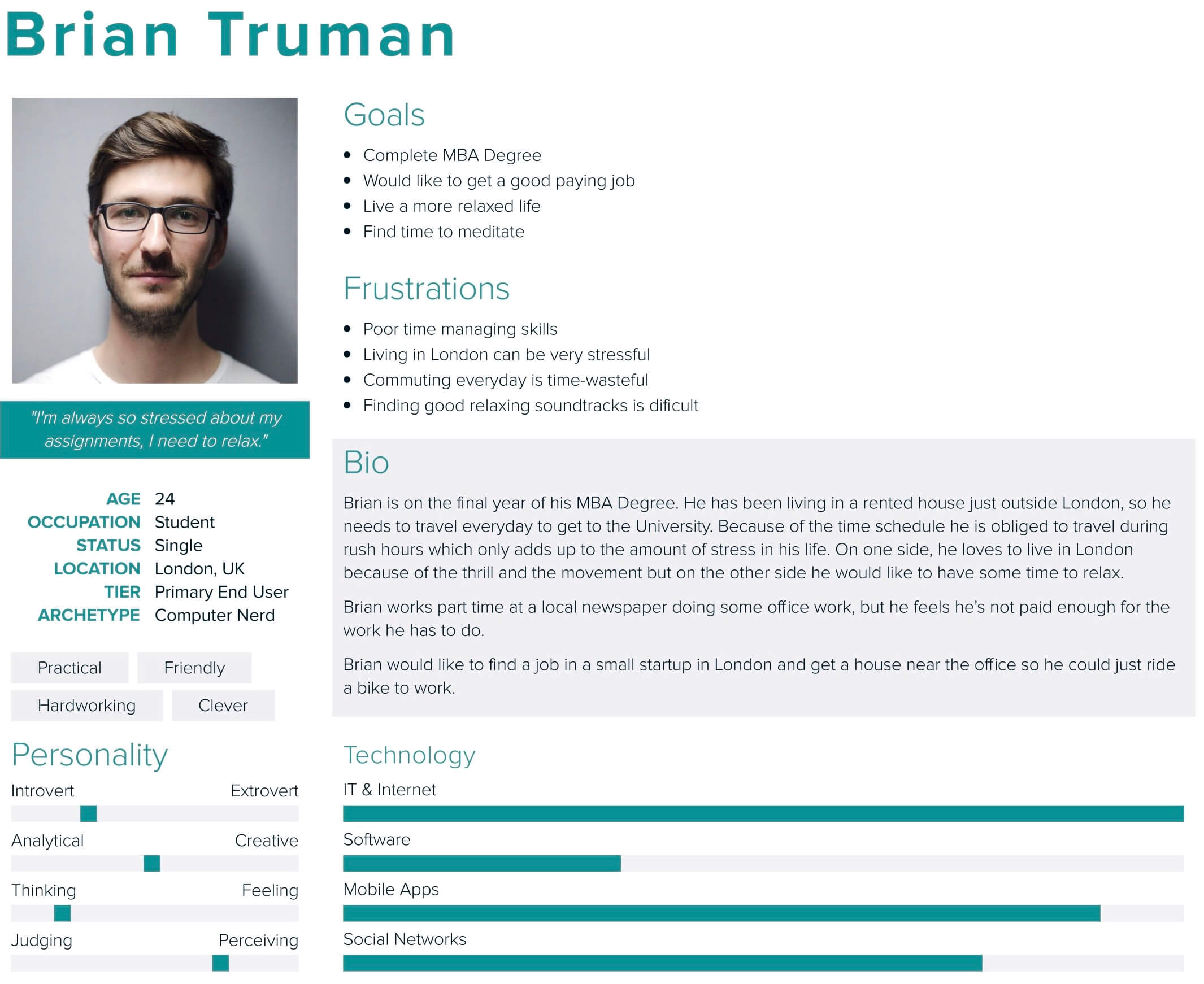
Personas should only contain information relevant to the project and specifically that may influence the UI & UX. They should be a personification of someone from the User Profile, as it is easier to match design decisions to a person than to a profile group.
Task Model
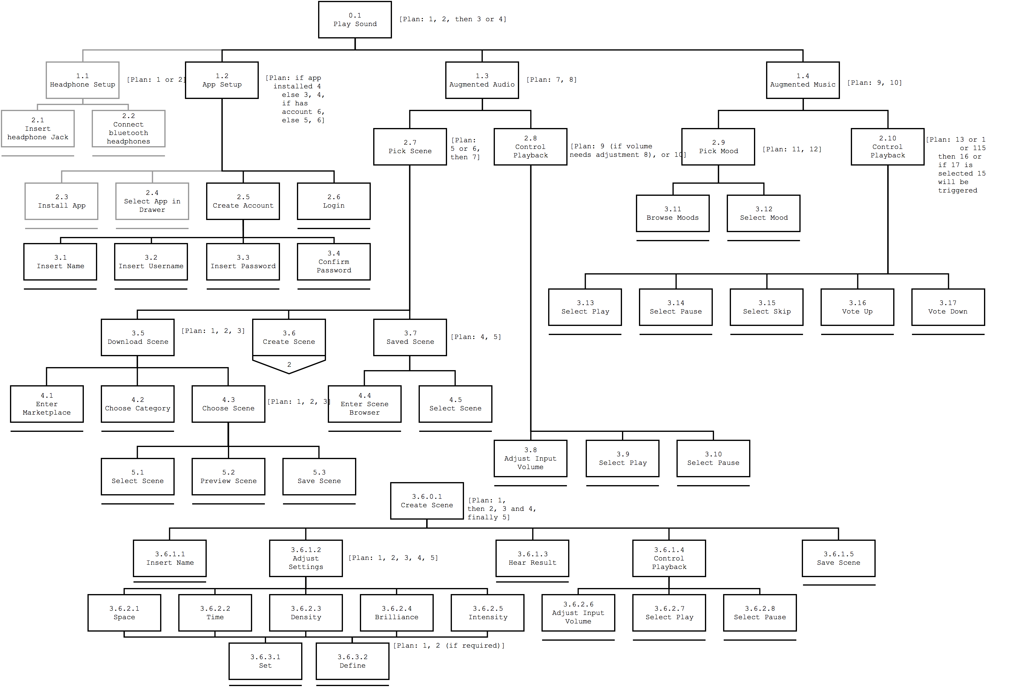
The Task Model provides an overview of the actions available in the app, as well as the options the user can select at each step of the interaction.
Scenarios
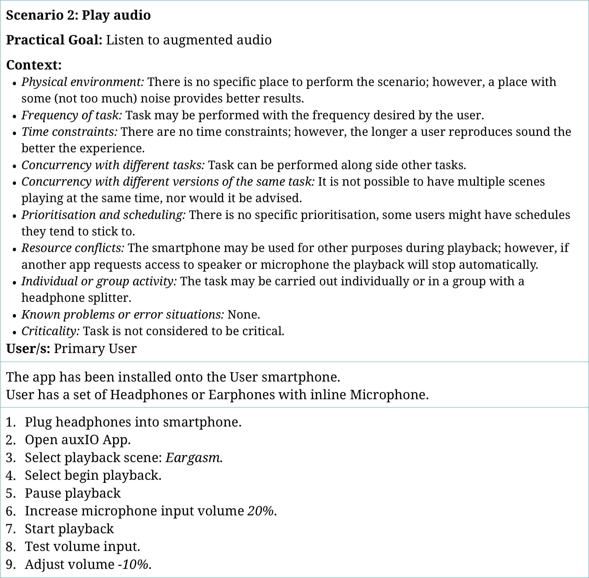
The Scenarios specify and provide more context to the task model.
Conceptual Model
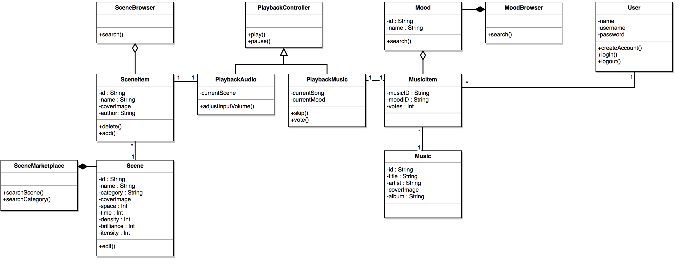
The Conceptual Model represents the relations between the entities in the app, such as the scenes, music, users, and audio.
Usability Requirements
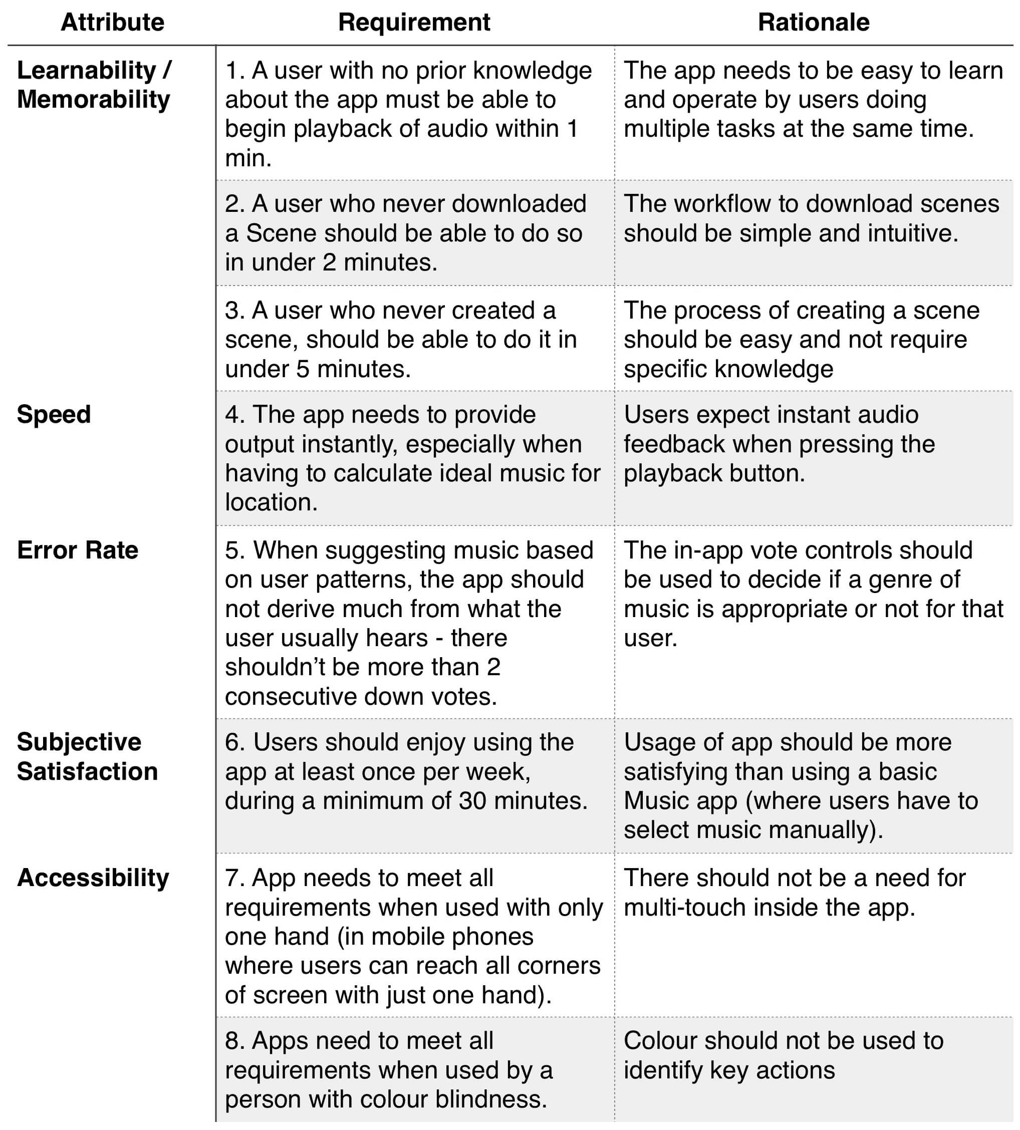
The Usability Requirements list the aspects related to usability that have design implications or are related to the way the app should operate. The most important requirements are related to the first usage, others are related to accessibility concerns.
Naive Wireframes
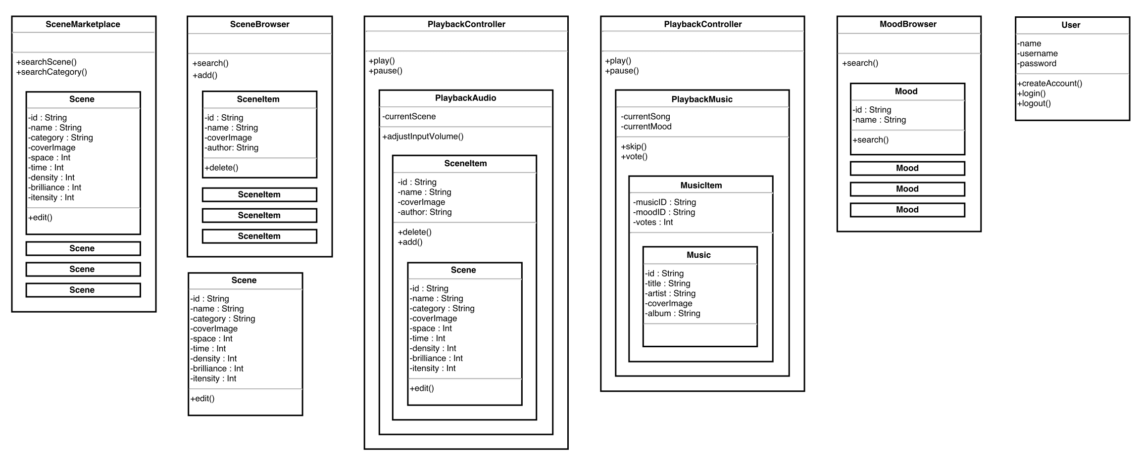
The Naive Wireframes technique starts from the Conceptual Model and assembles the interface using the boxes of each entity. The goal is to focus on the items required for each screen instead of how they look or where they’ll be placed.
Mockups
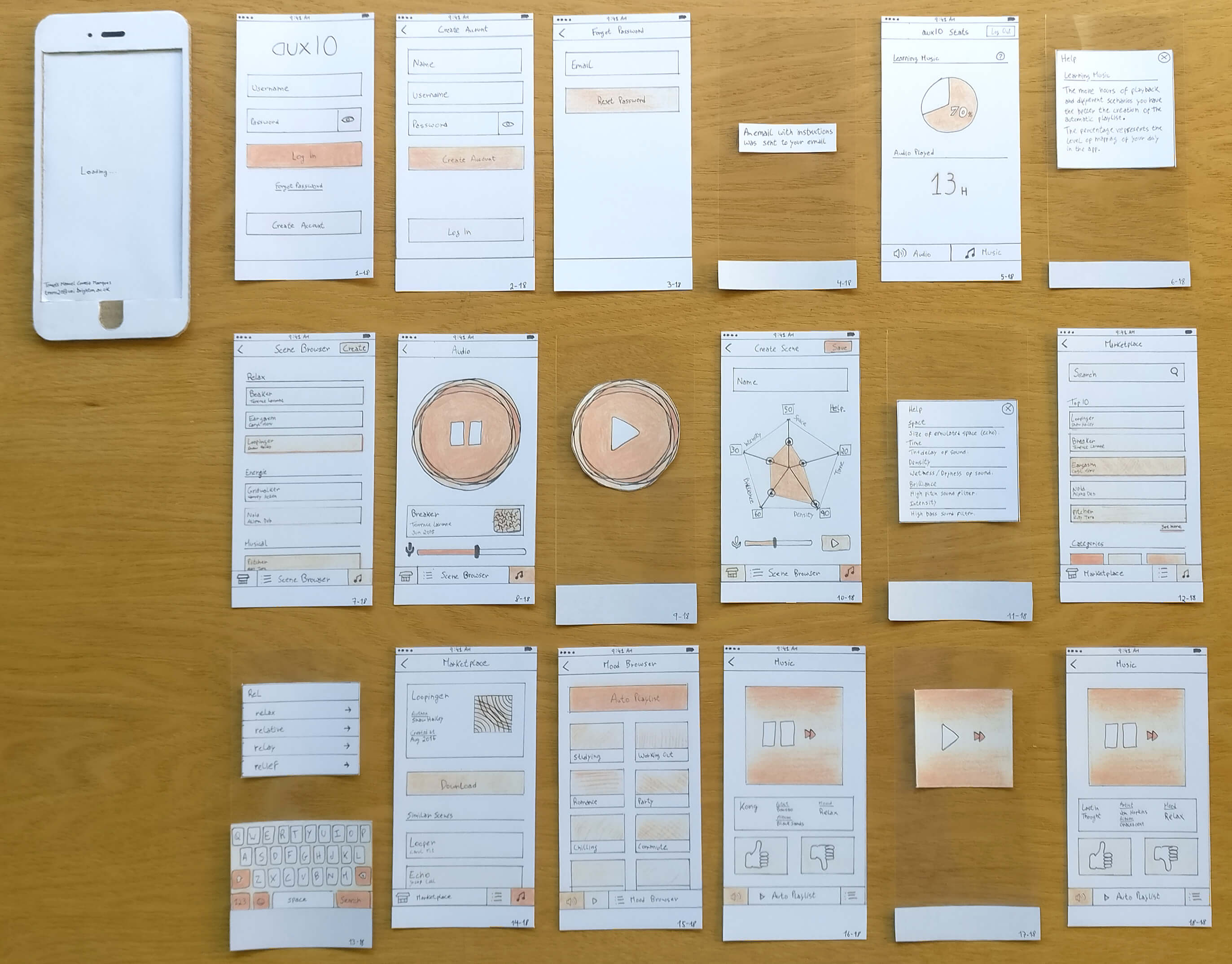
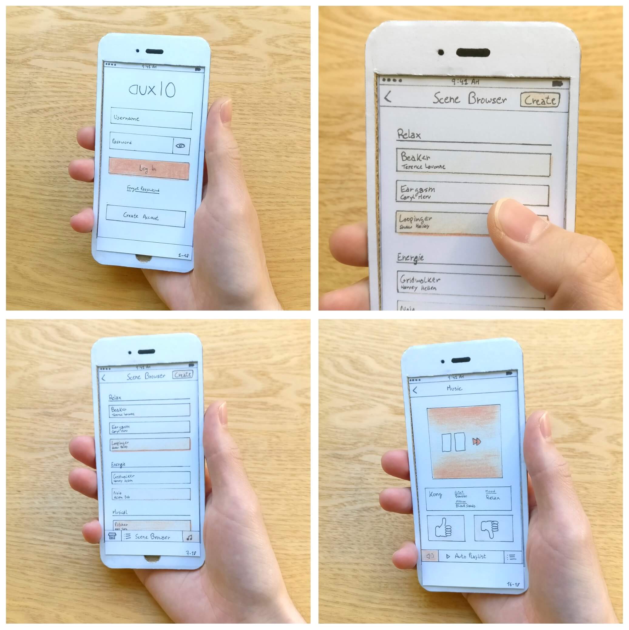
The Mockups were made on paper and there was a 1-to-1 prototype phone used to perform the usability tests with the screens in the actual size. There were also some overlay screens built with a transparent plastic sheet.
Prototype
As mentioned before, there was a physical prototype done with paper. During the usability testing sessions, feedback was gathered and in order to be integrated before future sessions, a digital prototype was created from scans of the sketches. The Final Design can be seen in action in the Interactive Prototype build with MarvelApp
Evaluation Report
Usability Testing
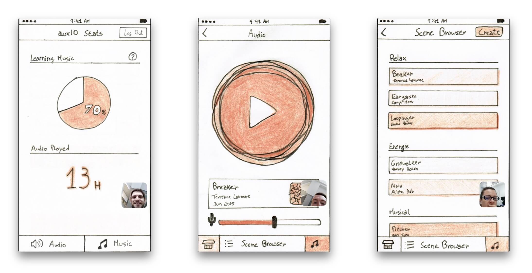
Several usability evaluation sessions were conducted. Both used the paper and digital prototypes. A plan was made to guide each session and to provide a basis for comparison between sessions. The Task Scenarios used for the User Testing were as follows:
1- Create Account
2- Play Audio
3- Adjust Microphone Input
4- Install new Scene
5- Create new Scene
6- Play Music
7- Pause Music
8- Vote Current Music
Cognitive Walkthrough Evaluation
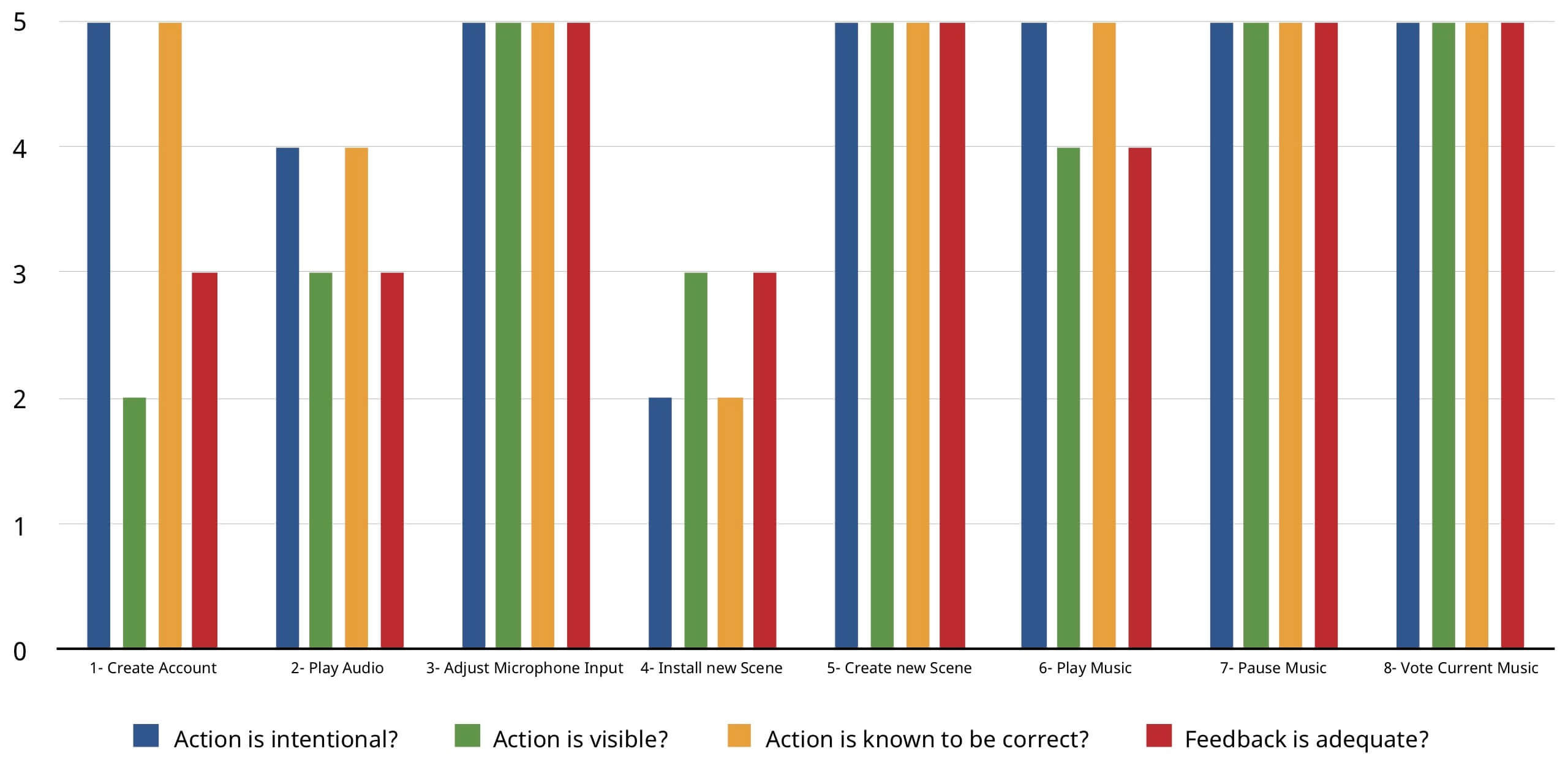
A Cognitive Walkthrough is an evaluation method were users go through the interface and for each action respond to four questions: is the action intentional, is the action control visible, does the user know that control provides the correct action, and is the system feedback adequate. The Cognitive Walkthrough Evaluation was performed by five users who had completed the User Testing. The results below show how many users responded yes to each question.
Focus Group
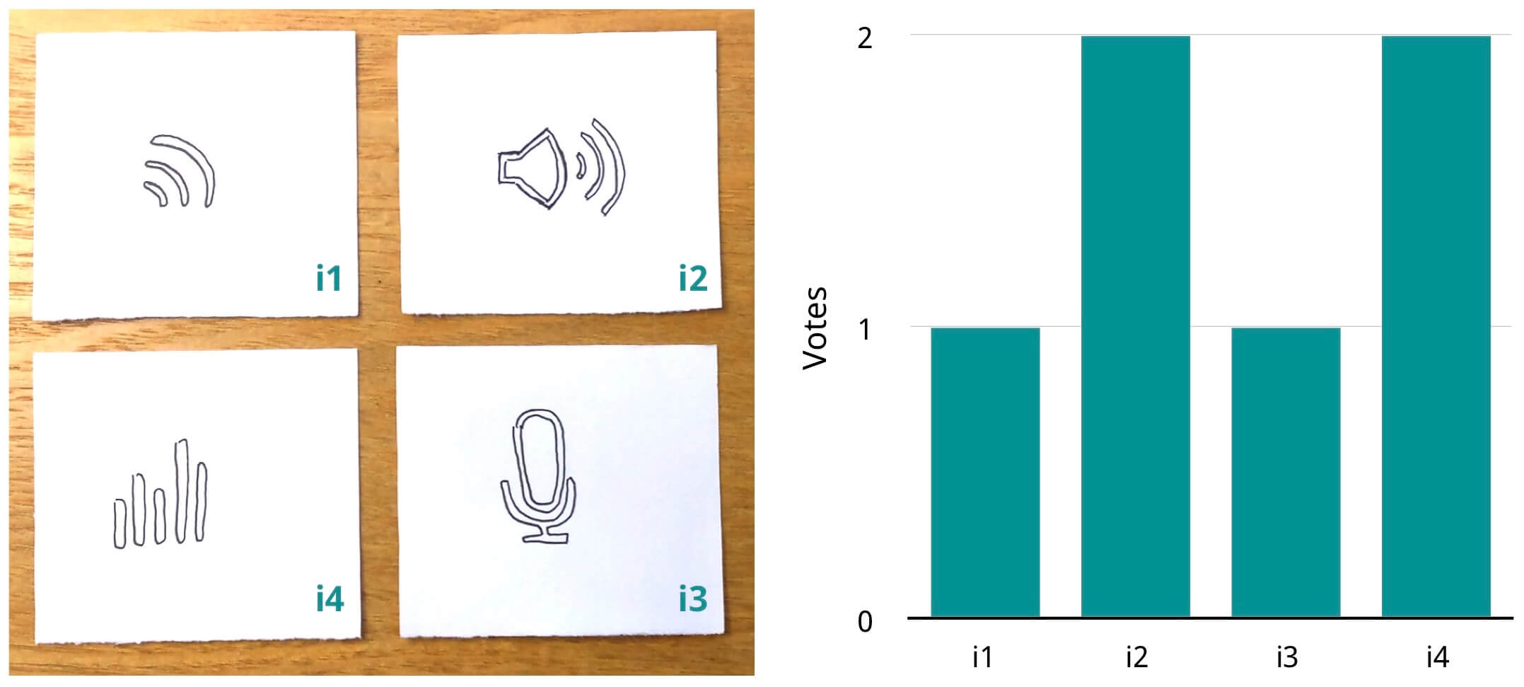
Users were asked which one of the icons below would best portray the concept of Audio in auxIO. The Focus Group was done after the User Testing and on the same subjects, so that each user would have an idea of what the app does and how it works. The icons were positioned in front of the user in a random order.
