Tangerine
Description Interaction Design Lead on CRM for small accountancy teams project called Tangerine.Tangerine manages emails, tasks, contacts and files. The product was created from the ground up starting with user interviews and competitor analysis; defining a design roadmap in conjunction with the development roadmap; planning, executing and analysing several usability sessions with real users.
1. Competitor Analysis
Nineteen competitors were identified and analysed. Each rated out of five stars. A conceptual model was annotated for each competitor in order to understand the terms used and their hierarchy with special focus on the four main concepts of a Template / Workflow, Task / Job, Activity / Steps and Sub-steps.
Information Architecture Analysis
Part of the Competitor Analysis, an Information Architecture (IA) Map was drawn for each competitor with the goal of determining the common structure and page hierarchy of the competitors. The majority of the competitors had a flat hierarchy with some having two levels at most (eg: Management page > Jobs page and Firm page > Contacts page).
IA Recommendation
As a result of the Analysis, a recommendation was made of the ideal Information Architecture structure and a couple of options for the main four concepts as they appear in the competitors. These recommendations were later validated with real users through interviews. The final recommendation was then discussed with the UI Designer to be applied on the mockups.
2. Design Roadmap
The Design Roadmap was created alongside the development roadmap in order to accommodate the usability sessions and interviews from the start. Careful consideration was put into defining the necessary elements for a successful UI; besides defining the main flows, screens and actions, special thought was put into establishing the transition, error and loading states, as well as outlining all the possible empty states and the required copy for each.
3. Usability Requirements
The usability requirements of learnability / memorability, speed, error rate, subjective satisfaction and accessibility were defined before starting the UI work in order to guide design decisions. Since Tangerine target group included accountancies with no previous experience with online management systems, special care was put into making sure no assumptions were made in regards to commonly found UI elements. Requirements included aspects such as time to create a task or client in the platform, loading time, user levels and restrictions, warnings copy and undo actions, color blindness and contrast levels.
4. Usability Testing
Usability testing was part of the planning from the start with the foal of evaluating the user satisfaction and verifying if the UX requirements were being met. Both moderated and unmoderated sessions were conducted using tools such as UsabilityHub click tests, Video Interviews, OptimalWorkshop Card sorting and Questionnaires.
Usability Test Plan
Each round of usability testing started with the draft of a Test Plan. This plan included the purpose of the sessions, request for consent in recording, qualitative evaluation questions, and general guidance for the session moderator and observer.
UsabilityHub
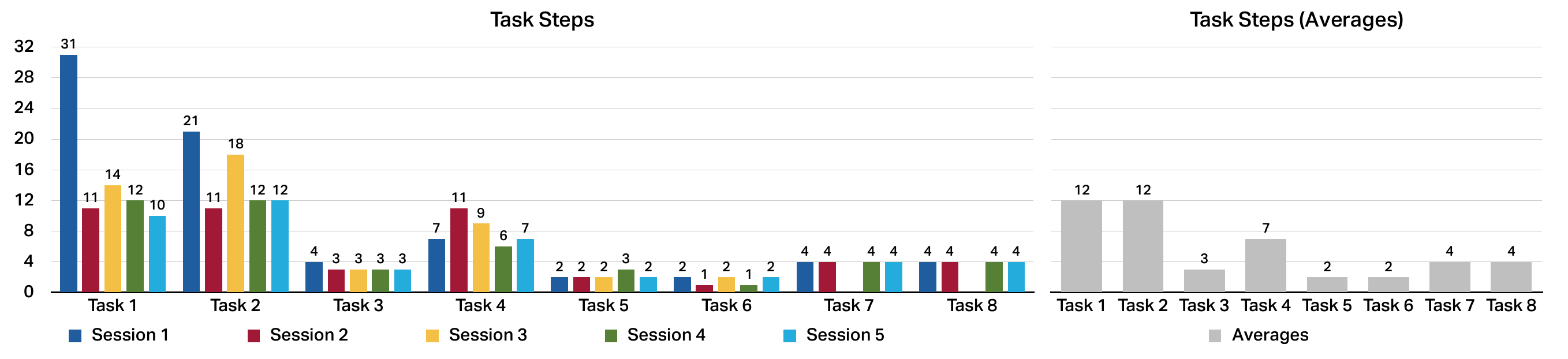
UsabilityHub click tests use images and hotspots to define the happy path(s) of a task, and questions to assess qualitative data. The results provide quantitative data such as success and failure rates, task duration, trouble areas (heatmaps + screens were users make most mistakes), and qualitative data (depending on the questions asked at the end).
There was an average of twenty answers per task (total of five tasks). The issues detected were rated in a four-level Severity Scale (Dumas & Redish, 1993): Cosmetic (subtle and possible enhancements/suggestions), Minor (problems have a minor effect on usability), Serious (creates significant delay and frustration), Catastrophic (prevents task completion), and compiled in a Report with the improvement recommendations (one minor and five cosmetic), an improved IA and some general feedback provided in the qualitative area of the tests.
Generally, UsabilityHub provides a good platform to conduct simple usability tests. Some negative aspects include it not being clear for the user when the test was complete (since there was no UNDO option, the test could end without the task being complete), also if the user did not answer the end questions the test would not be saved. Positive aspects include the heatmaps for where users clicked the most, the ability to filter out the qualitative part based on the click test, and the fact that it is free for a self recruited user-base.
Task-Based Evaluation
For the Task-Based Evaluation, a clickable prototype was built based on the tasks defined in the Usability Test Plan taking in consideration both the happy path (when the user follows the expected route) and possible mistakes.
A total of five sessions were conducted using video chat and screen sharing. The results were compiled into a report of actionable feedback; one serious, two minor and three cosmetic issues were detailed as well as general comments and conclusions.

Despite having interviewed users that were part of the target group, one of the most important conclusion was the disparate mental model of the users. Since some had used more automated tools than others, they were more familiar with certain terms and required less explaining about what the tool was doing.
System Usability Scale (SUS) Questionnaire
The SUS Questionnaire is a ten question survey to access Usability. Te results are graded 0-100 but they are not a percentage. Previous research shows the average SUS score is 68. Score above 80.3 means the software is amongst top 10% of scores, this is also the point where users are more likely to be recommending the product to a friend.
Users that participated in the Task-Based Evaluation were then asked to fill the SUS Questionnaire. The result was an average of 92.45 that is equivalent to an A+ score (best imaginable).
Card Sorting
Card sorting was conducted with OptimalWorkshop tools as they provide an easy drag and drop interface and analysis tools. The goal of the card sorting was to understand what tasks users thought belonged to certain processes and in what order they expected to do them. A side objective was to understand if a different copy would make the tasks and the process clearer.
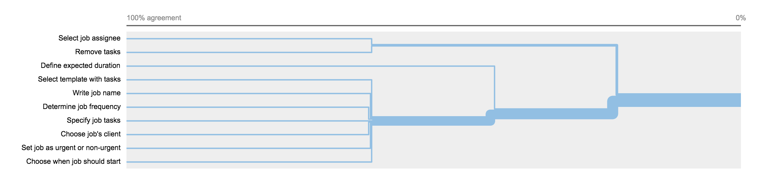
There were three processes to be tested each with about ten tasks; two tasks per process were explicitly written to be excluded so that users did not think all tasks should be selected.
Copy Evaluation
Copy evaluation testing was done in order to understand if users metal model matched the system’s model. Concepts such as job, overdue, urgent, workflow, and linking can mean several different things to separate users, but in the context of the application they should have similar connotations.
These sessions highlighted the need for default pre-loaded templates or a guided tour with examples. The output report included a visual representation of the most common words used by users to describe each concept.
Final Notes
This project was a joint venture of Pomar and Whitesmith; because of intellectual property regulations, the information shared here was restricted to the process and key takeaway points.