yon
Description Yon is a mobile app and accompanying devices that aim to turn any equipment into an IoT connected device, allowing the user to control his devices and appliances from anywhere. The key point is the conversion of existing equipment since IoT-enabled devices are very expensive.The yon project employed a User Centred Design approach integrated with the JTBD (Jobs To Be Done) theory to produce a mobile app with an improved product-market fit.
The word “yon” comes from the Old English geon, of Germanic origin, and it means “distant but within sight”.
Process
The yon project was structured by applying a User Centred Design approach (Discovery, Concepting and Building & Testing) integrated with the JTBD Theory.
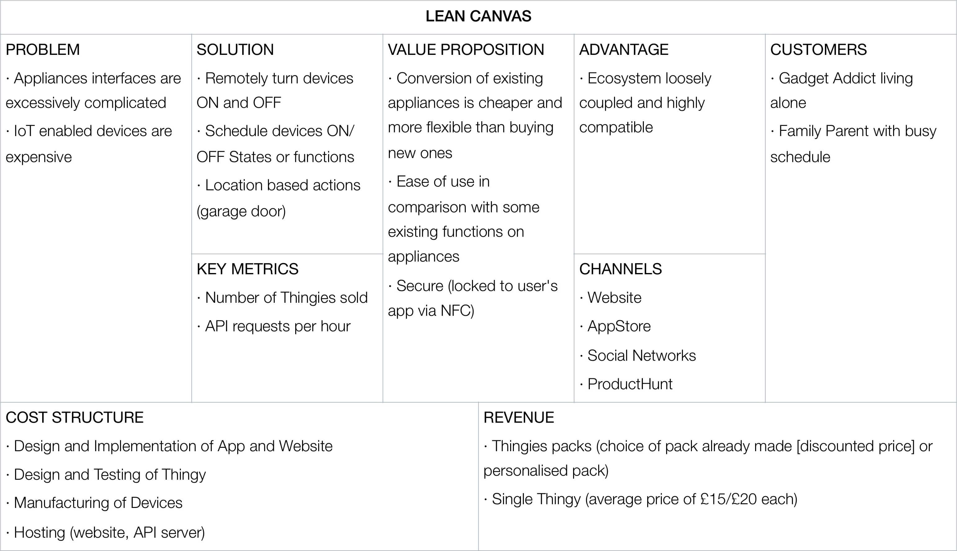
Lean Canvas
The Lean Canvas is a variant of the Business Model Canvas and condenses the main aspects of an idea in an easy to digest diagram with the most relevant elements.
1. Discovery
The Discovery included the analysis of the current IoT Market and possible Competitors, the definition of the Audience for yon, Interviews and Content Surveys, and their analysis towards the creation of a Jobs To Be Done goal and subsequent Job Stories.
Audience Definition
In order to better specify the target audience for yon, two sets of User profiles were created. According to JTBD theory, it is important to differentiate between Customers and Users. A customer is someone who paid for a product. A user is someone who uses it on a daily basis.
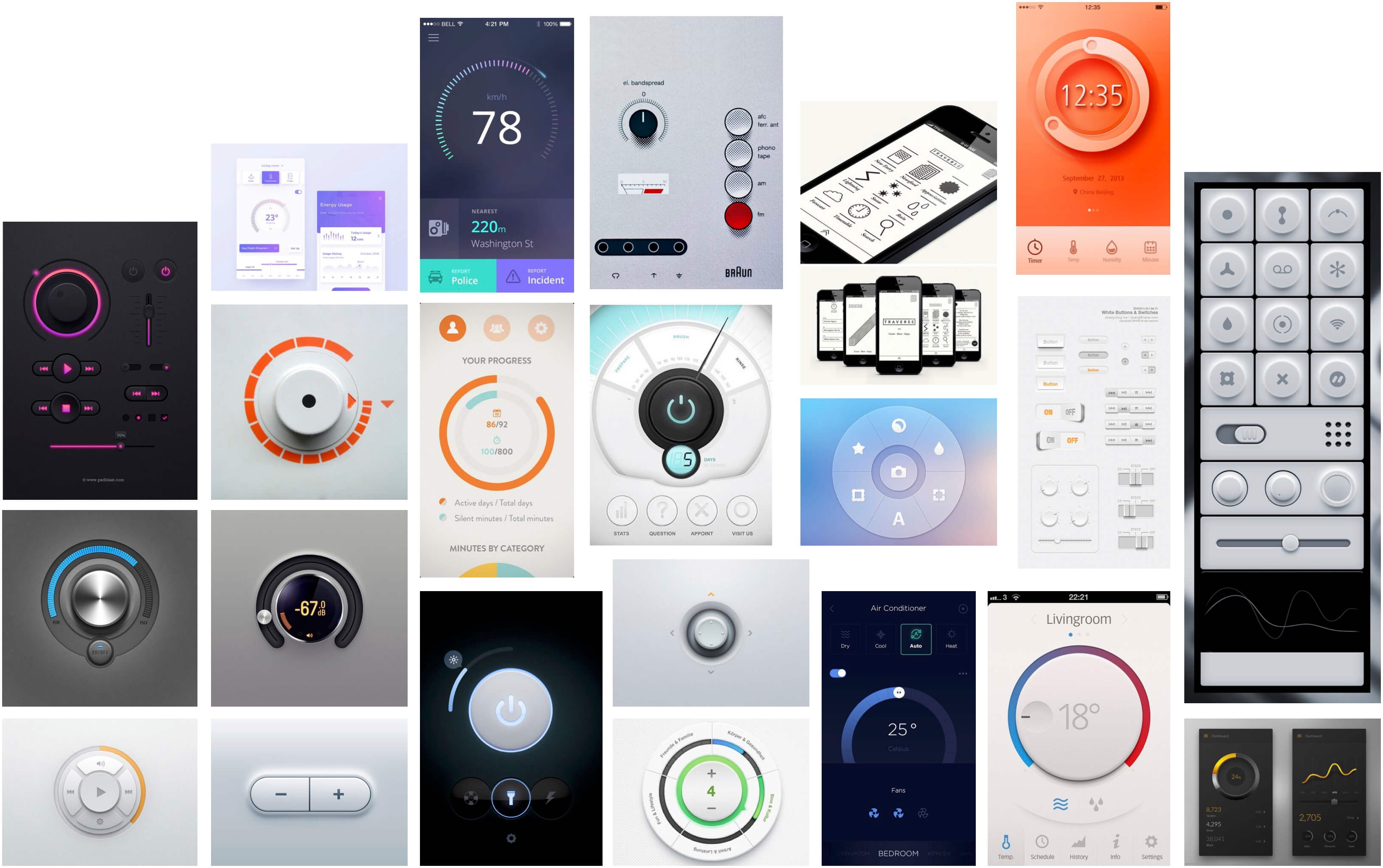
Mood-board
The mood-board contains the graphic inspiration used to design the User Interface of the yon app.
Content Survey
In order to get access to a wider audience for the content survey, the Amazon Mechanical Turk platform was used to create a Questionnaire. The Questionnaire had a total of 110 responses. The Questionnaire was composed of 5 questions relating to the current workflow of users, desires and goals.
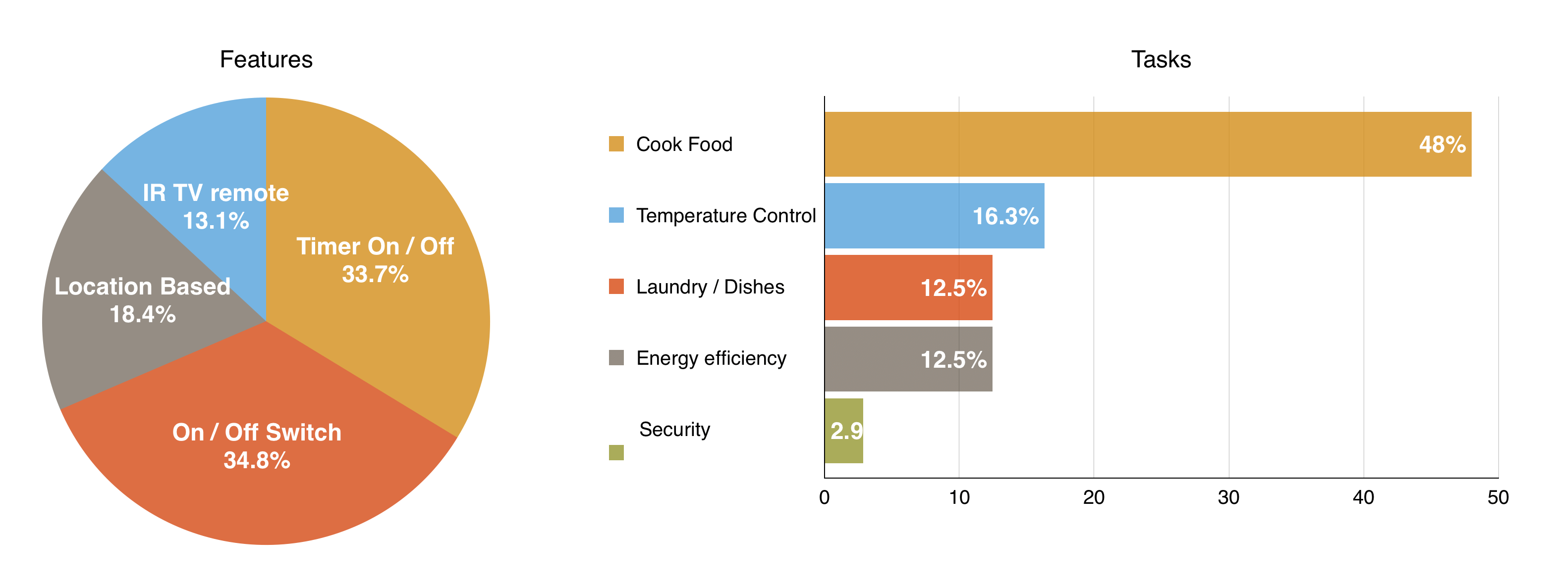
The results from the Questionnaires showed the appliances and devices users would like to control with a system like yon, and “why” and “what for” they would like to control them (tasks and features).
The Appliances list was used to determine what device icons should be designed depending on the number of people that would like to control them.
JTBD Interviews
JTBD theory states that in order to better suit an audience needs, interviews and questionnaires should be done. The script for the interviews conducted was similar to the questionnaire from Amazon Mechanical Turk, with more scenarios for discussion such as how users solved the problem in the past, if users were satisfied with current solutions, if there were any other alternatives they might consider, what users thought they might be able to do with it that they couldn’t do before and how their life would change with the product.
Here are some of the interview insights sorted by topic:
- Food Situation
Current solutions: Quick meals with little to no cooking required, or cook food previously (requires better scheduling, and not applicable to unexpected situations).
Satisfaction level: Low, due to limited variety in the diet. - Forgetting to lock Door Current solutions: Hope no one notices, physically return home.
Satisfaction Level: Medium, would become low if happened often. - Watching TV
Current solutions: TV timer function is confusing to set, would ask someone to turn it off.
Satisfaction level: Medium, sleep quality is decreased. - Appliances Control
Which appliances: oven, washing machine, external blinds, AC, router.
JTBD Forces of Progress
Based on the results from the Interviews and the Mechanical Turk Questionnaires it was possible to extract the current struggles and desires users have.
JTBD theory uses the Forces of Progress to help define a successful product, by analysing current solutions, competitive edge, fears and habits of users. The four Forces of Progress are Push – why solution does not work, Pull – what is better about this product, Anxiety-in-choice – what fears buyers might have – and Habit-in-use – what could be eased in the transition.
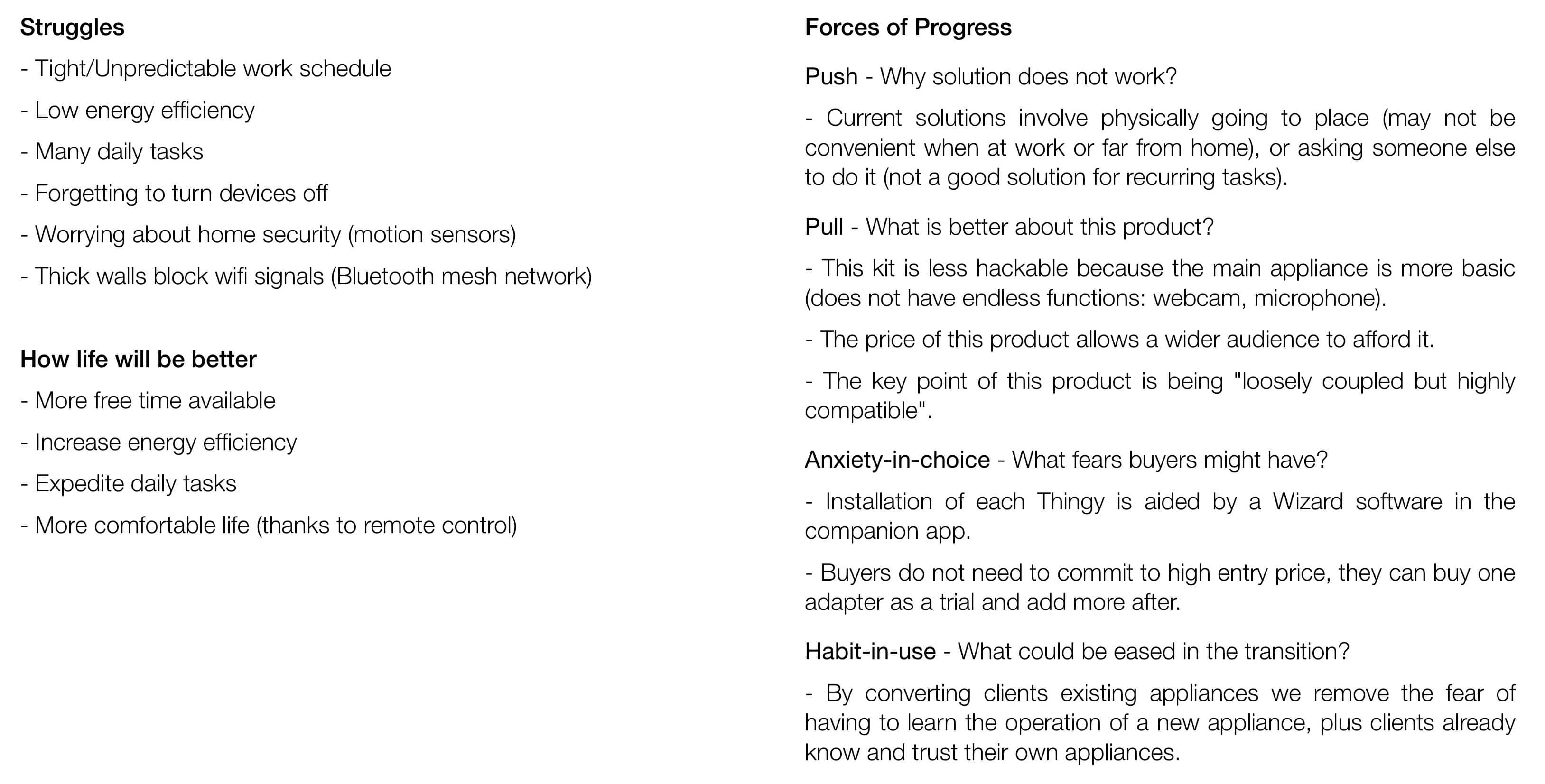
JTBD Competition (in User’s mind)
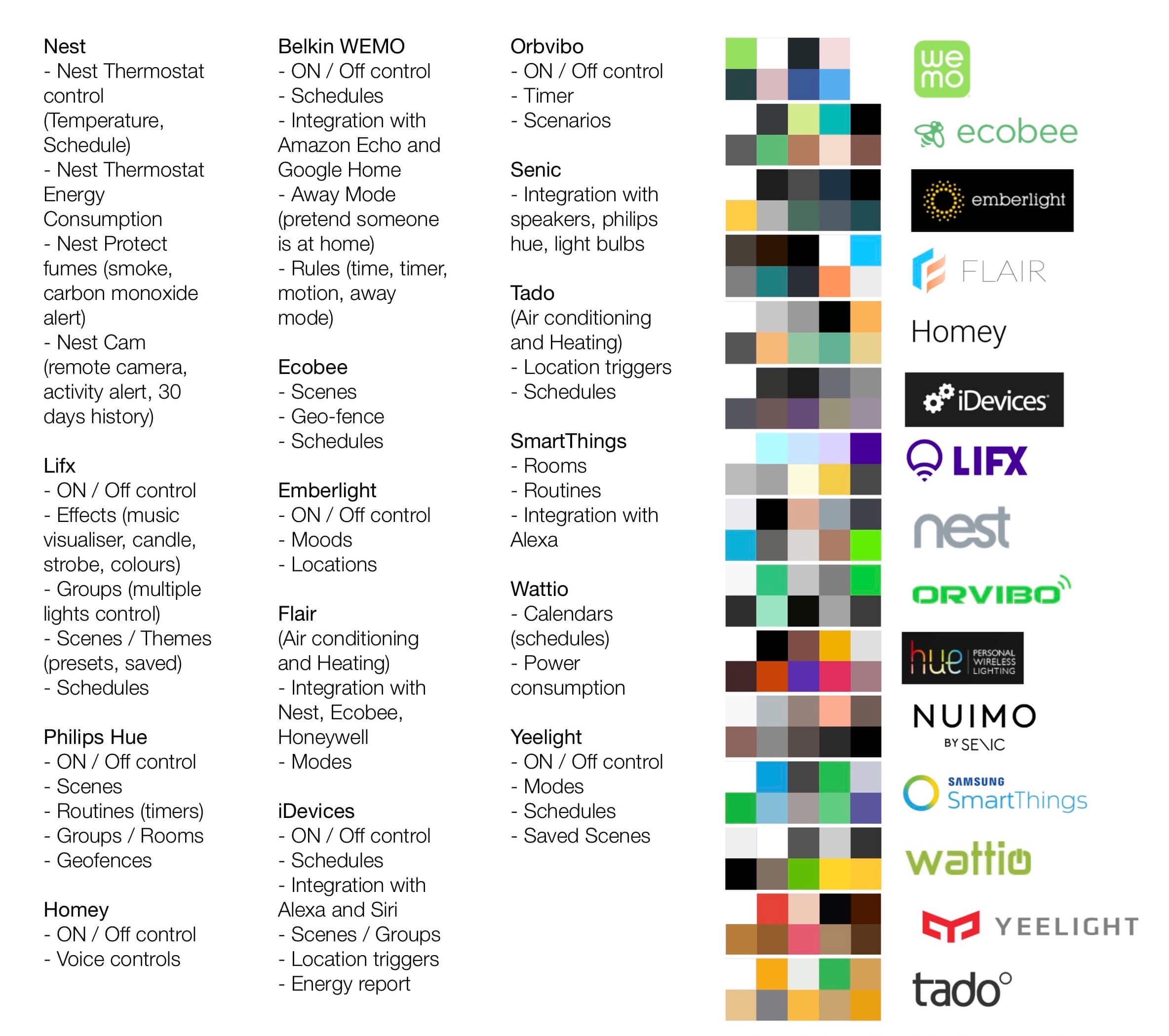
In terms of Competition that was fired (JTBD terminology for something that is no longer used), this system would replace buying takeaway food, asking someone for a favour, using regular remotes or built-in timers.
As part of the Competitor analysis, a breakdown of the competitor’s features was made, as well as a comparison of UI colours and logos.
Job definition
Based on the insights from the Interviews, the answers from the questionnaire, the struggles and forces of progress, the Main Jobs were defined.
According to JTBD theory, it is important to frame the main job in several different ways to better specify the issue and the motivation.
Besides defining the main JTBD, multiple Job Stories should be defined to help identify smaller problems and motivations. These smaller jobs are equivalent to scenarios.
Below are the four main JTBD defined for yon.
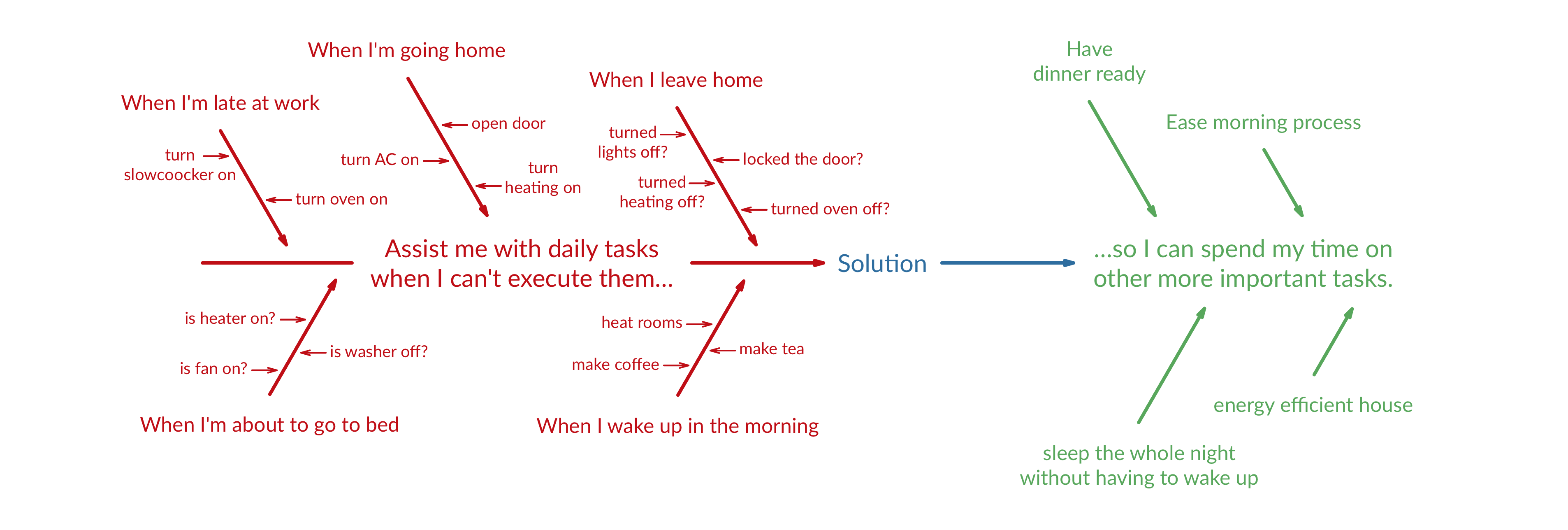
Assist me with daily tasks when I can’t execute them so I can spend my time on other more important tasks.
Expedite daily tiring tasks when necessary so I can have more free time.
Free me from daily tasks when I’m on a tight schedule so that I can relax and focus on other tasks.
Help me automate boring things when I don’t want to perform them.
Job Story Diagram
The Job Story Diagram demonstrates the relationship between the Job Stories and the main JTBD.
Value Proposition Canvas
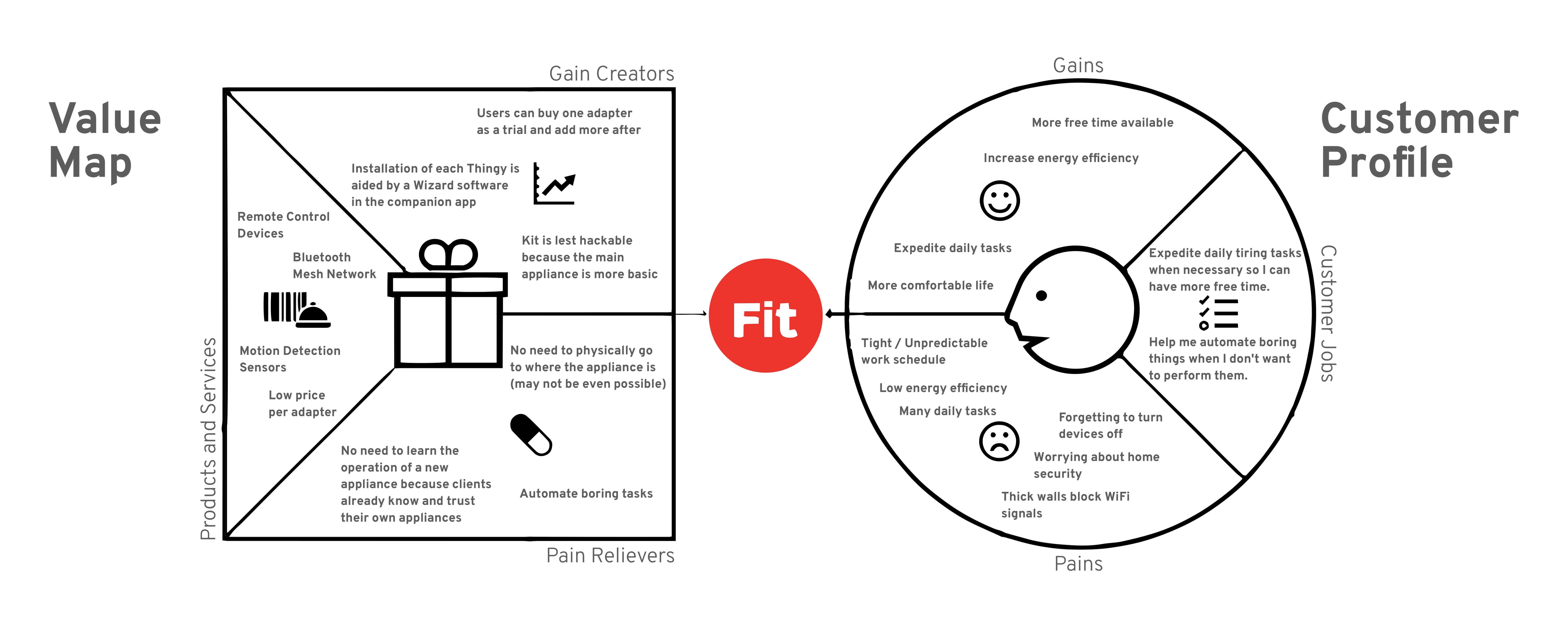
The Value Proposition Canvas is a good way of checking if the designed product or service matches the needs that users reported and if the gains and pains are balanced on the product or service.
2. Concepting
The Concepting phase begins with the definition of the Usability Requirements and Features / Tasks the system would allow its users to perform. With a set flow diagram, the wireframes and sketches for the screens were created.
Usability Requirements
The Usability Requirements are based on the Sharp’s “Usability Goals and Metrics”: Learnability and Memorability (Ease of learning how to use and remembering how to use once learned), Efficiency (Speed and productivity), Safety (Error Rate), and Effectiveness and Utility (Subjective Satisfaction).
Task Model
The Task Model is useful to map all the available functions of a system. To create the Task Model, all the tasks were listed and compared with the functions required to satisfy the Job Stories and ultimately the JTBD.
The Task Model is exceptionally useful to check if there is any step missing, or if there is any function lacking.

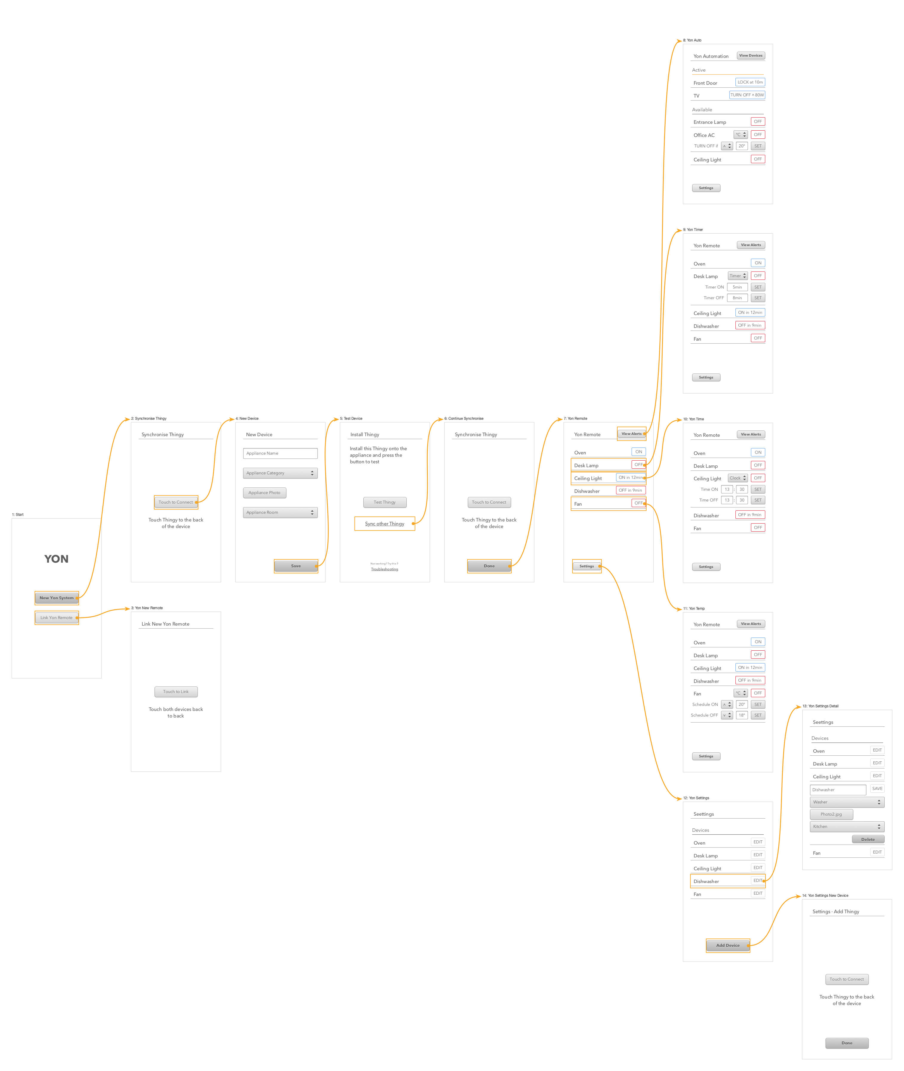
Process Flow
The Process Flow is similar to the task model but uses the interfaces screens instead of its tasks. It is especially useful to check if there are any screens missing in a specific action path.
This Process Flow was created with the first Wireframes of yon interface.
3. Building & Testing
In the Building & Testing phase, prototypes were created from the sketches drawn, and these were tested by users. The Concepting and Testing phases were iterative, meaning that after the first round of tests new Wireframes were created. When the interface was performing as expected in the user tests, the final design was created and a final prototype was built.
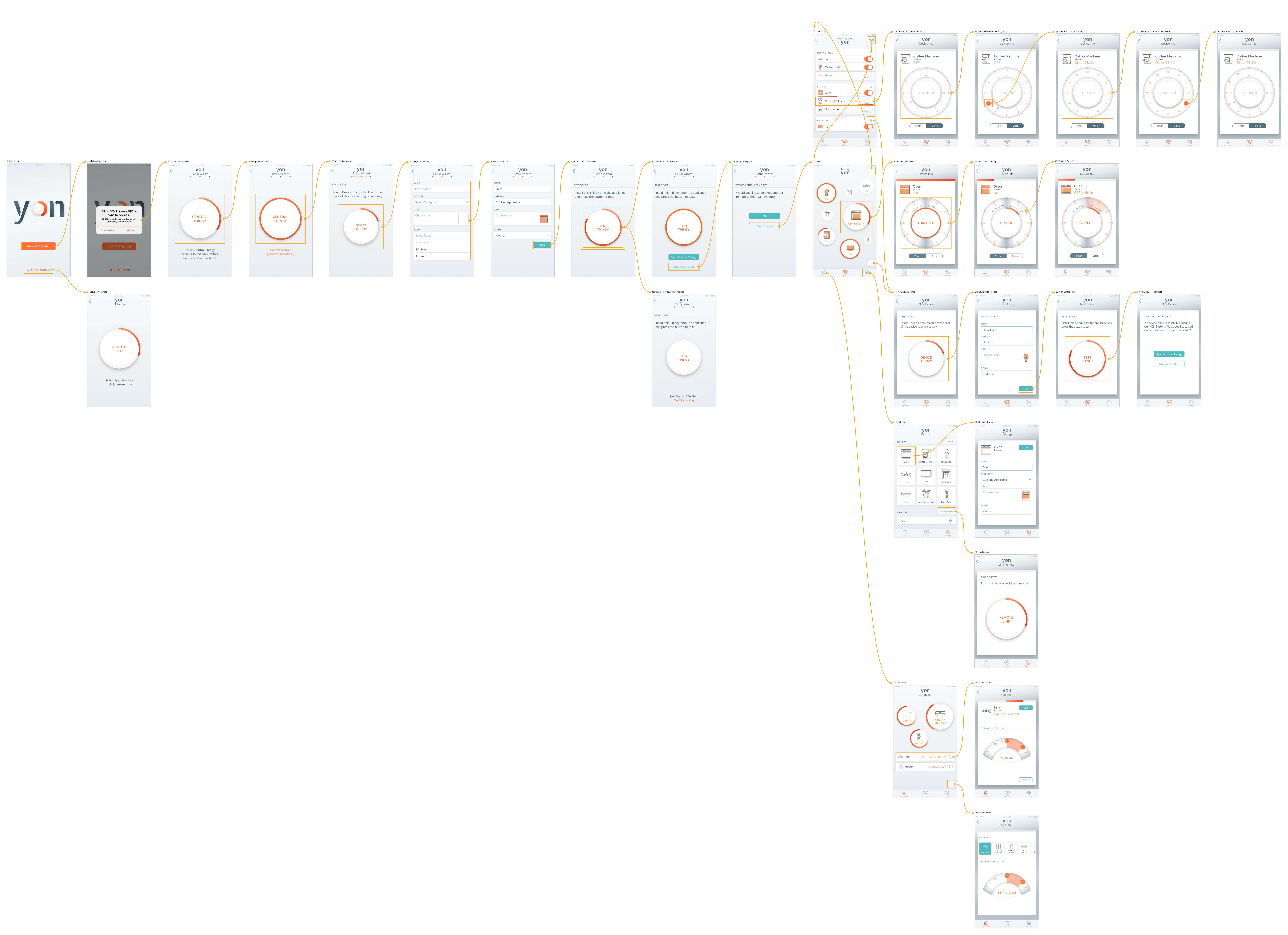
User Flow
The User Flow for the Final Design contains all created screens with their connections.
Prototyping
The prototypes used for User Testing are available at Sketch Version Prototype and Final Design Prototype. The last user testing round used the Final Design Marvel Prototype.
User Testing
In order to define the tasks for the Observational Evaluation, the Jobs defined in the Concepting phase were converted into actionable tasks and commands.
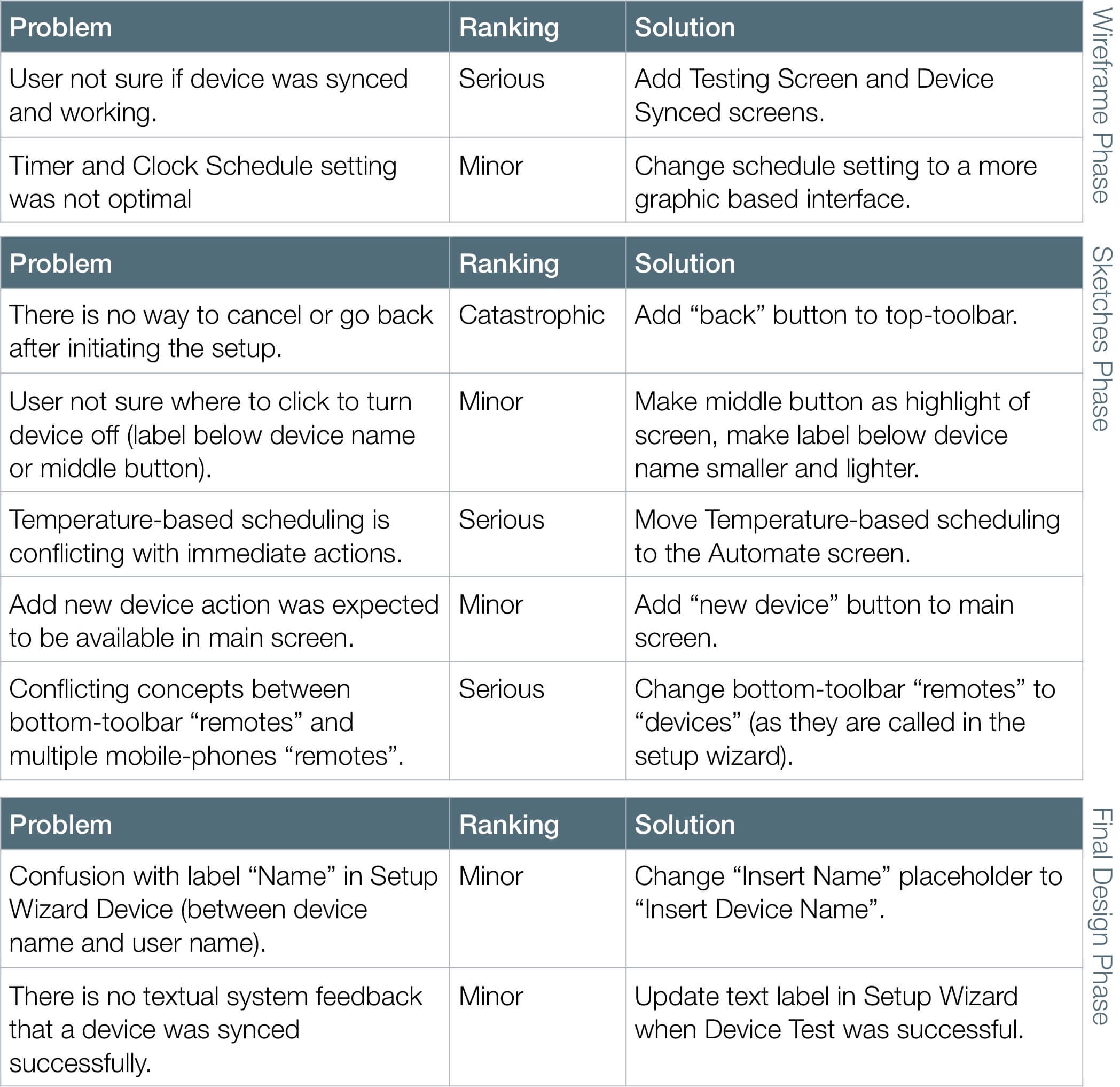
There were three rounds of Observational User Evaluation: Wireframe Phase, Sketches Phase, and Final Design Phase.
The problems found were ranked using a Three-Point Severity Scale. All problems found were successfully fixed, and further User Testing confirmed their resolution.
Out-of-context icon testing
Besides the Observational Evaluation of yon’s interface, out-of-context icon test was also done. It was important to verify if users would be able to identify what each of the icons represents because there are screens in the interface where only the icon is used. On the other hand, since users are the ones who pick the icon for each device, their mental model will decide what is the correct meaning for each icon.
Most of the icons were correctly portraying their meaning. It was also interesting to discover that some icons had a lot of flexibility in their meaning, for example, the icon for the pressure cooker also works as a rice cooker, or even a deep fat fryer.
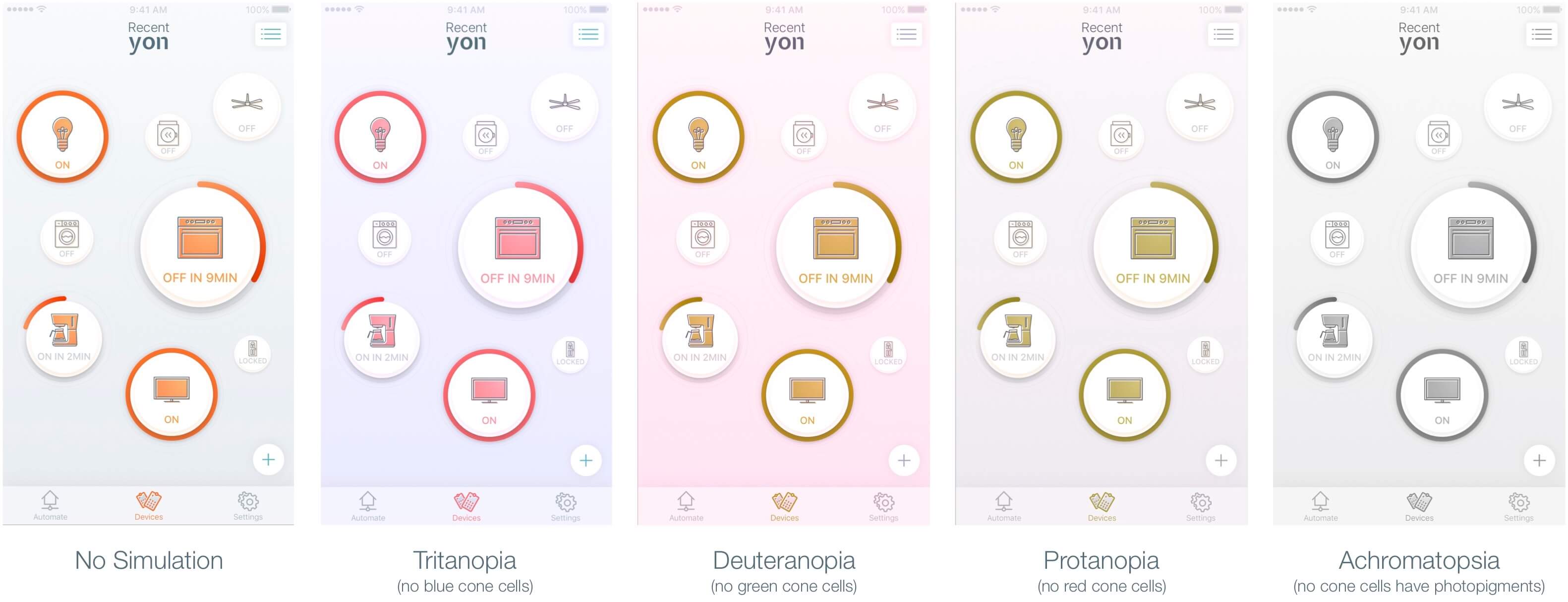
Colour Blindness Testing
Finally, yon’s interface was also tested using a SketchApp plugin called Stark. This plugin allows one to see the interface through a window that simulates each Colour Blindness condition. As it can be seen in the Figures below, although colours appear different their meaning is still conveyed properly (due to the right amount of contrast between each element). The full circle is a very good visual cue to indicate if a device is ON or OFF, even when there is no colour differentiation. The element that suffers the most is the bottom navigation (it is harder to see what is the current screen).
Final Notes
This project was a case study developed for the MSc User Experience Design based on a brief to create an interaction design project with a demonstrable prototype (limited-functionality executable prototype). The prototype was put through usability testing with real users and consent was formally given prior to each session.
